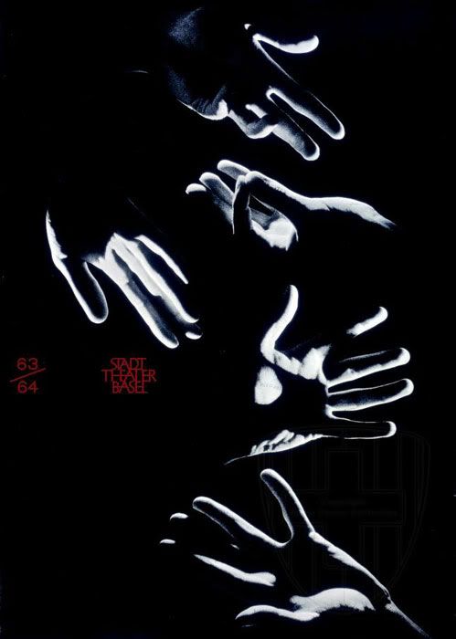
Hofmann believed in little use of colour because of what he believed was the 'trivialization of colour' in the art world at the time. That belief is what makes some of his pieces so strikingly beautiful. This poster gives emphasis to the hands, ghost-like, and when paired with abrasive red script, the poster gets a little bit of haunting quality to it.
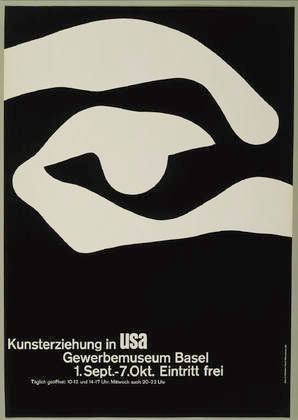
The founding of his 'swiss style' in typography included cleanliness and readability, as well as a preference of photographic images over illustrations; this poster epitomizes this and this is why his work translates so well into the modern world, where anyone with a computer can now photoshop their own photographs with text.
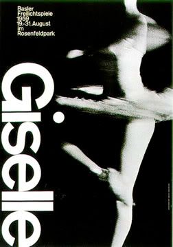
Some of his posters reminded me of the exercises we did in class with typography - although he doesn't push the envelope too far because of his beliefs on legibility, he gave new inspiration to the way typography could be used, considering most of his work dates back to the 50s and 60s.
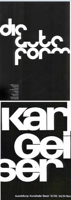
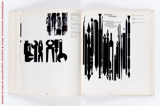
I also found these pieces of work, though I can't be sure what media they were meant for - his use of simple shapes, layout and high contrast with black and white are really interesting, and his work does seem really forward thinking, because in my opinion, this looks like it could be used nowadays, or could very easily be translated into film.
No comments:
Post a Comment