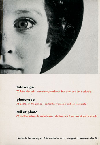
Jan Tschichold was a typographer, book designer, teacher and writer. Tschichold was the son of a provincial signwriter, and he was trained in calligraphy. This training set him apart from almost all other noted typographers of the time, since they had trained in architecture or the fine arts. He became a leading advocate of Modernist design: first with an influential 1925 magazine supplement; then a 1927 personal exhibition; then with his most noted work Die neue Typographie. This book was a manifesto of modern design, in which he condemned all font s but sans-serif. This book was followed with a series of practical manuals on the principles of Modernist typography which had a wide influence among ordinary workers and printers in Germany.
After the election of Hitler in Germany, all designers had to register with the Ministry of Culture, and all teaching posts were threatened for anyone who was sympathetic to communism. After Tschichold took up a teaching post in Munich at the request of Paul Renner, both he and Tschichold were denounced as "cultural Bolshevists". Ten days after the Nazis surged to power in March 1933, Tschichold and his wife were arrested. During the arrest, Soviet posters were found in his flat, casting him under suspicion of collaboration with communists. All copies of Tschichold's books were seized by the Gestapo "for the protection of the German people".

Typographers and book designers apply these principles to this day, with variations related to the availability of standardized paper sizes, and the diverse types of commercially printed books.
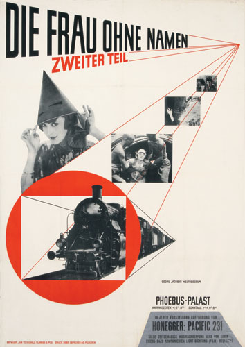
 In 1923 Tschichold visited the Bauhaus exhibition in Weimar where he was introduced to Modernist design and quickly joined the movement. Influenced by the new typography at Bauhaus, he began to use serifless typefaces and designed simplified layouts. Rather than sticking to traditional fonts and symmetrical composition he began embracing sans-serif typefaces, geometric construction, and asymmetrical composition. His work, intended to represent the rationalism of the modern age, was functional, aesthetically satisfying, and designed for reproduction by machine-type composition and newer printing technology.
Typefaces Tschichold designed include Transit (1931), Saskia (1931/1932), Zeus (1931) and Sabon (1966/1967) named after Jaques Sabon. Sabon was designed to be a typeface that would give the same reproduction on both Monotype and Linotype systems.
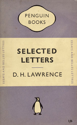
From 1947 to 1949 Tschichold was typographic designer for Penguin Books in London. Here he designed more than 500 title pages and specified the future typography for the Penguin series of paperbacks.Before his arrival the design of individual books had appeared cohesive, at least compared to those of rival publishers, but had varied with the views of the editor and printer. A firm believer in typographic systems, Tschichold designed a template for all Penguin books with designated positions for the title and author’s name with a line between the two. He unified the design of the front, spine and back and redrew Edward Young’s endearingly amateurish Penguin symbol in eight variations. Finally he produced a set of Composition Rules which, he insisted, were to be followed by Penguin’s typographers and printers to ensure that the same style was always applied.
All the dodgy underlining and bold bit were due to an error with the HTML codes.. hope it's still readable.
ReplyDelete